Scope: Logo Design, Brand Identity
Client: Private Commission
Client: Private Commission
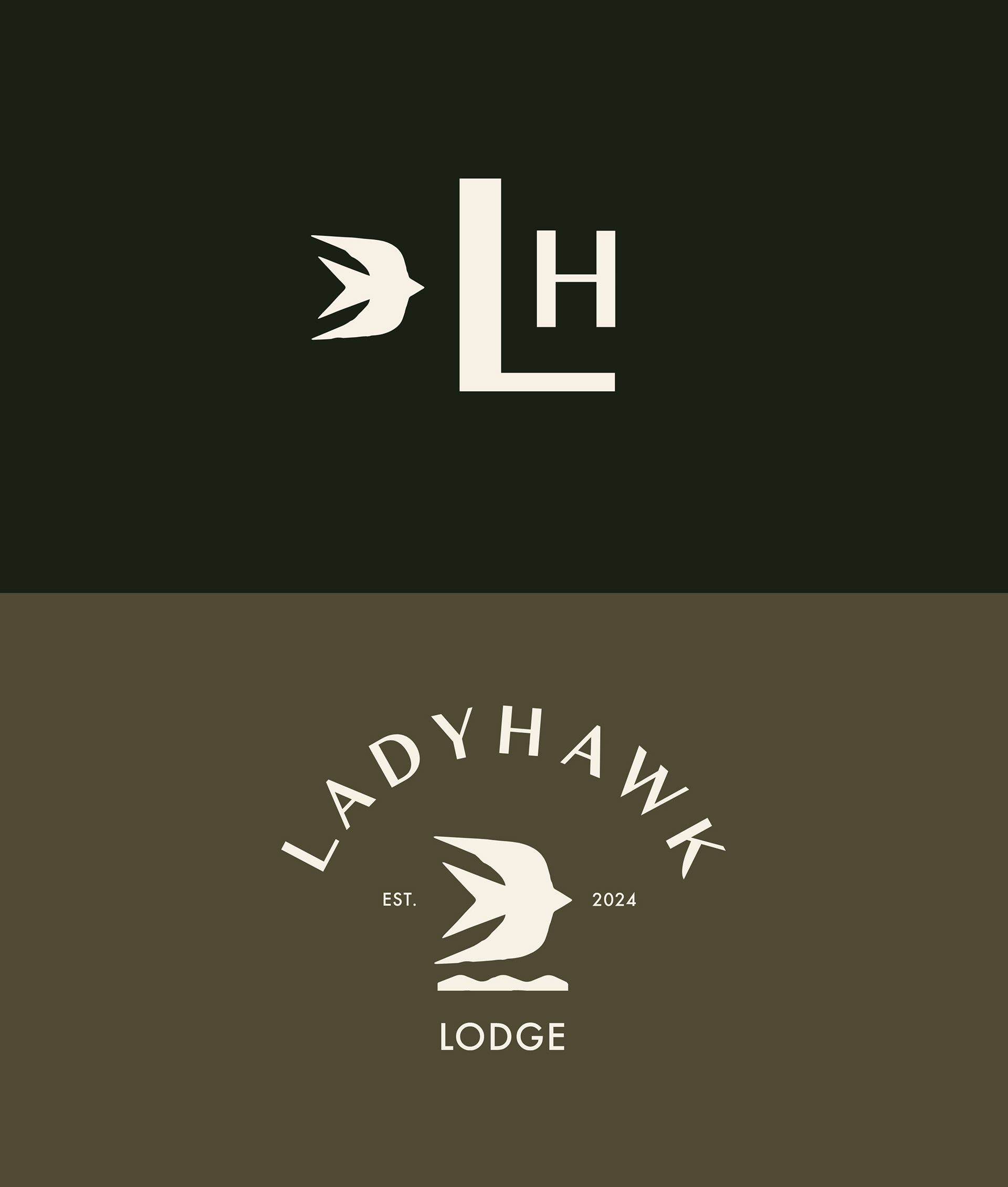
Ladyhawk Lodge is a branding project rooted in family and nature. The client envisioned a logo that symbolized his three daughters, a mountain, a boat, and a hawk — each element representing a piece of their story. My approach was to merge those symbols into one simplified yet meaningful mark that could carry the emotional weight of the story while remaining clean and versatile.
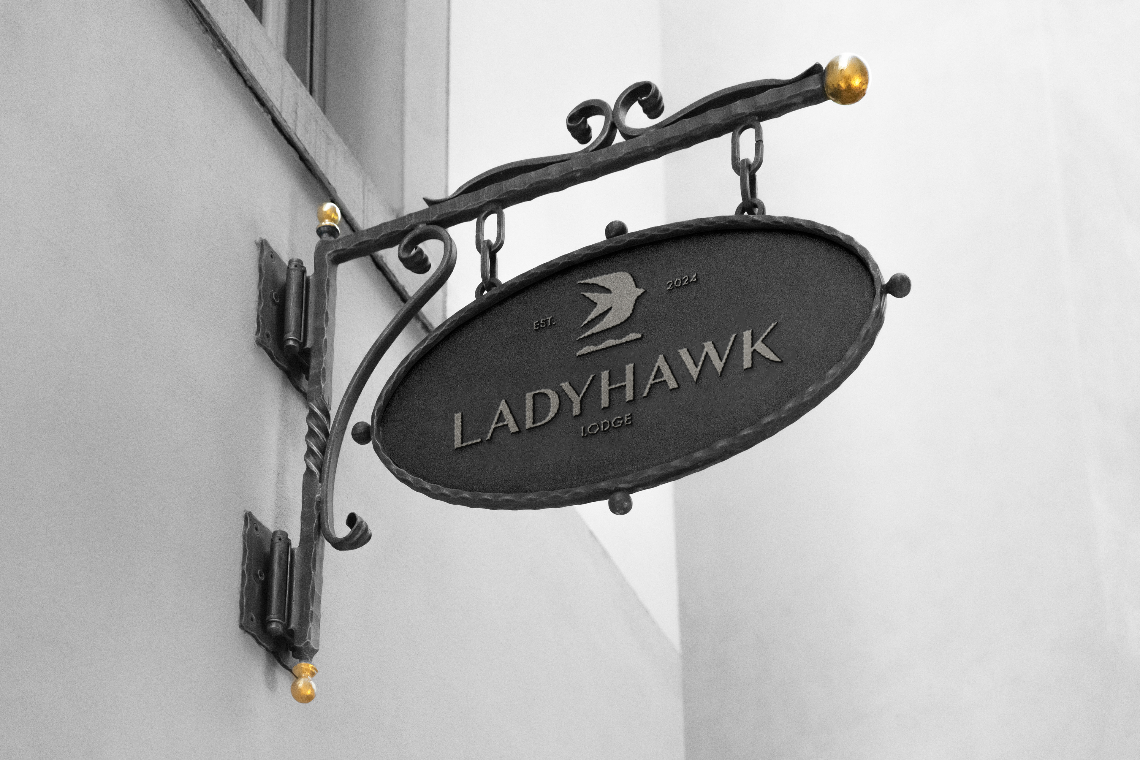
The final logo feels timeless and elevated, perfectly suited for a lodge experience. It’s now being used across guest robes, merchandise, signage, and web applications — a quiet but powerful emblem of legacy.
The final logo feels timeless and elevated, perfectly suited for a lodge experience. It’s now being used across guest robes, merchandise, signage, and web applications — a quiet but powerful emblem of legacy.


